Of all the commonly asked pieces of personal information which users are asked for when completing online forms the date of birth causes users the most issues. I say this as on many of the websites I’ve worked on, analytics data has shown that it’s the Date of birth field that creates the highest number of errors which indicates users find it tricky to complete.
Why is this and are the issues the same on desktop and mobile?
This blog post investigates some of the different approaches taken when asking users for their date of birth by some well know websites and looks into the pros and cons of these.
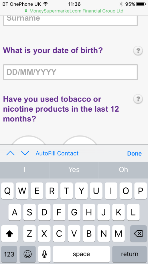
Life Insurance application form on Moneysupermarket.com
Solution
One field with place holder text DD/MM/YYYY

Pros:
• Users with high or good levels of computer literacy are likely to find this quick and easy to use
• Allows the user to enter the day and month as one or two numbers (1/1/1970 or 01/01/1970)
Cons:
• Users with lower levels of computer literacy may have issues entering the required format. If entered in the format 1/1/1970 then the user has to enter the slashes but if the format 01011970 is entered the slashes are added in automatically after the user tabs out of the field
• When the user starts to input into the field the place holder text disappears and the user may not remember the format (Desktop and mobile)
• Displays a standard alphabetic keyboard on mobile so the user has to switch to their numeric keyboard
Life Insurance application form on Comparethemarket.com
Solution
Separate dropdown boxes on desktop and separate pickers on mobile for day, month and year
Desktop:

Mobile:
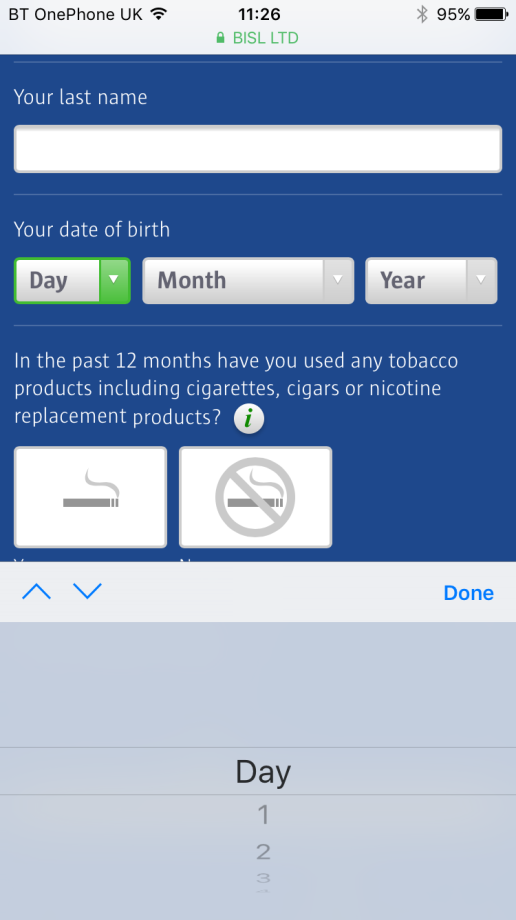
Pros:
• It’s almost impossible for the user to enter their date of birth in the wrong format except if they enter a date combination such as the 31st February which in this case an inline validation message is displayed
• This approach may be easier for people with low computer literacy levels to use as the answers are predefined
Cons:
• There’s a long list to scroll through to select the year
Life Insurance application on Beaglestreet.com
Solution (desktop)
Separate text input fields for day, month and year

Pros:
• The required format is still displayed when the field has been selected and data inputted

Cons:
• The website doesn’t work in IE10 or below
Solution (Mobile)
One date picker for day, month and year
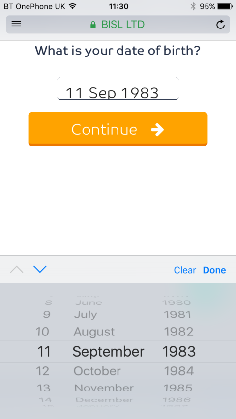
Pros:
• The user can select the day, month and year sequentially in one picker
Cons:
• There’s a long list to scroll through to select the year.
• The user can select a year in the future (but an inline validation message is displayed).
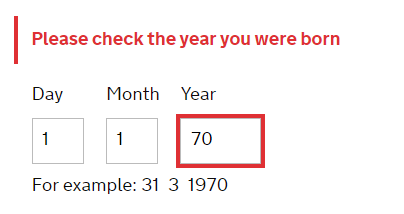
Voter registration form on gov.uk
Solution
• Individual input fields for day, month and year
• Example date displayed underneath
• Numeric keypad displayed on selecting a field (mobile)
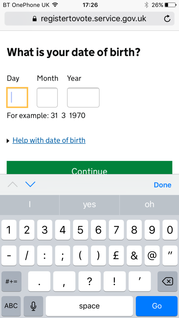
Pros:
• The user only has to enter numbers
• Accepts: 1 1 70 and 01 01 1970 formats
• Validation errors shows the particular field which has the error
• On mobile the numeric keyboard is displayed when a field is selected
• Works on all standard browsers including older versions of IE
Cons:
• Susceptible to users entering the year in the wrong format
Further Info
Jo Lanman, an Interaction designer at the Government Digital Service (GDS) explains the test and learn approach taken in coming up with the date of birth capture for the Register to vote project in the blog post – Asking for a date of birth.
So which solution is the best?
Well is depends on your users. MoneySuperMarket’s main user base will be highly computer literate and therefore are less likely to have issues with entering their date of birth in the right format whereas the voter registration website we need to cater for all users with differing levels of computer literacy and therefore they need to make the solution as simple as possible.
As with most things simplest is usually the best. The three separate input fields with clear labels for the expected format or an example date works well, using informative validation messages specific to the relevant input box if the user has entered something incorrectly. I do like the three separate dropdown boxes as they have the advantage of making it difficult for someone to enter data in the wrong format but dropdowns can be fiddly to use especially for long lists.
It’s an important point to note that I haven’t assessed the solutions in terms of accessibility as many of them can be accessible or not depending on how they are coded.